Mastering CSS Arrangement: Techniques and Hints
Are you struggling to create visually stunning and flexible designs for your web pages? Look no further! In this article, I delve into the essential techniques and sophisticated strategies for mastering CSS layouts. Ranging from basic concepts to expert guidance, you’ll learn how to develop dynamic and engaging web designs that operate seamlessly across multiple devices. Get ready to elevate your CSS skills to unprecedented levels!
What is a CSS Arrangement?
Before I jump into it, let me clarify what CSS layout is all about. A CSS layout refers to the technique of positioning and organizing HTML elements on a webpage through Cascading Style Sheets (CSS). It involves setting the dimensions, position, and order of elements such as text, images, and forms to create a visually appealing and functional webpage layout. Personally, I find this process incredibly satisfying, as it allows me to transform a basic structure into a beautifully designed and user-friendly webpage. The choices made during this process are crucial because they determine how the final layout will look and function, and I’m always excited to explore different solutions to achieve the desired outcome.
Why is a CSS Arrangement Essential?
There are several reasons why CSS layouts hold such importance. First and foremost, they help create a consistent look and feel across a website, allowing designers to apply the same styling to multiple pages. This uniformity makes navigation easier for users and helps them find the information they need more efficiently. Furthermore, CSS layouts enable responsive design, which allows web pages to adjust their layout and content based on the screen size of the device being used. This adaptability is essential for delivering a positive user experience on mobile devices. In my experience, having a responsive design has become increasingly important as more people rely on their smartphones for browsing the web. Lastly, CSS layouts empower designers to create complex, multi-column layouts that are difficult to achieve using traditional HTML tables. This capability makes it a powerful tool for building modern and dynamic web pages.
Basic CSS layout Techniques
When it comes to creating layouts with CSS, mastering the fundamentals is crucial. I will cover the basic layout techniques you should know to build simple and effective layouts. These techniques include:
- Box model
- Display property
- Float
- Position
- Clear
Box Model
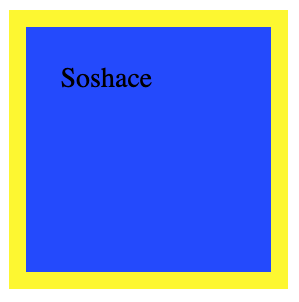
The box model is a foundational principle in web design, referring to the rectangular containers created for HTML elements. Each container comprises four distinct areas: content, padding, border, and margin. I’ve found these areas to be crucial in shaping the way elements are sized, positioned, and interact with one another. It’s fascinating to see how manipulating these areas can dramatically transform a web page’s look and functionality. Let’s take this code for example.
<!DOCTYPE html>
<html>
<head>
<style>
  .box {
    width: 100px;
    height: 100px;
    background-color: blue;
    padding: 20px;
    border: 10px solid yellow;
    margin: 30px;
  }
</style>
</head>
<body>
  <div class="box">Soshace</div>
</body>
</html>
This code simply shows the properties of the box model in use, and as you can see this is the result I got.

Display Properties
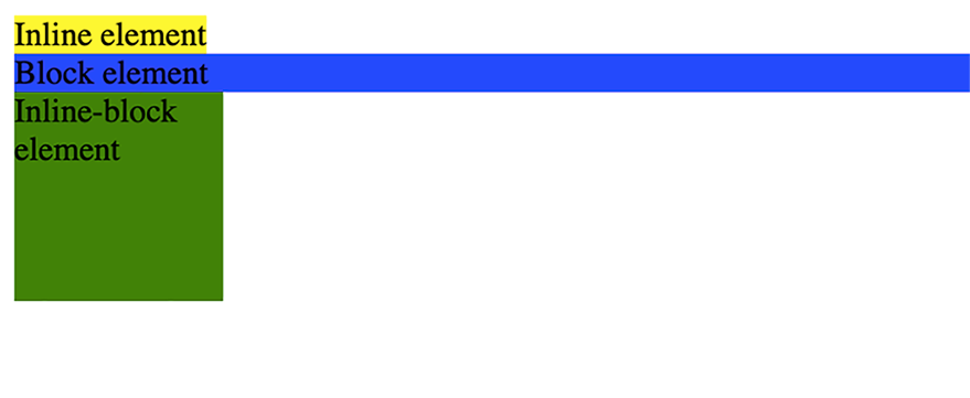
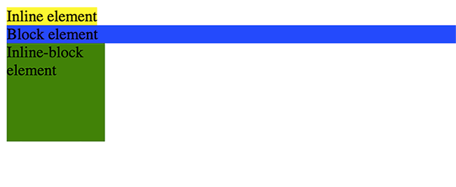
The CSS display property is responsible for dictating how an element appears on a web page. The most frequently used values include block, inline, and inline-block. I find these values to be essential in shaping the layout and flow of a webpage. Block elements occupy the entire width of their container and always begin on a new line. In contrast, inline elements naturally flow alongside text content. The inline-block elements strike a balance between the two, behaving similarly to inline elements while still allowing for width and height adjustments like block elements. In my experience, mastering the display property and its values has been crucial in creating well-structured web pages, as it offers precise control over the placement and arrangement of various elements.
To illustrate let’s consider this code block;
<!DOCTYPE html>
<html>
<head>
<style>
  .inline-element {
    display: inline;
    background-color: yellow;
  }
  .block-element {
    display: block;
    background-color: blue;
  }
  .inline-block-element {
    display: inline-block;
    background-color: green;
    width: 100px;
    height: 100px;
  }
</style>
</head>
<body>
  <span class="inline-element">Inline element</span>
  <div class="block-element">Block element</div>
  <div class="inline-block-element">Inline-block element</div>
</body>
</html>
This is how it looks.

Inline element, Block Element, Inline-block element
Float Properties
The float property in CSS is employed to shift an element to the left or right within its container, enabling text and other inline elements to wrap around it. The possible values include left, right, or none. From my perspective, this property is particularly useful in creating visually appealing layouts, especially when it comes to positioning images or other media within text content.
<!DOCTYPE html>
<html>
<head>
<style>
  img {
    float: left;
    margin-right: 10px;
  }
</style>
</head>
<body>
  <img src="https://blog.soshace.com/wp-content/themes/soshace-blog-2018-v2/img/soshace-logo.png" alt="Example Image" width="100" height="100">
  <p>Text wrapping around the image floated to the left. Lorem ipsum dolor sit amet, consectetur adipiscing elit. Proin hendrerit, velit eu finibus tristique, metus lectus aliquet libero, quis eleifend libero orci sed sapien. Pellentesque at eros sed dolor tristique tristique non ac turpis. Vestibulum non felis ipsum. Sed blandit magna vitae est aliquet, id convallis ante scelerisque. Donec interdum nisl non lorem convallis, non lacinia ipsum sollicitudin. Donec convallis quam at erat pulvinar, et ultricies metus interdum. Sed vel metus purus. Sed scelerisque elit enim, sit amet venenatis mauris bibendum vel. Aliquam et euismod risus.</p>

</body>
</html>
Without the float property the `img` would sit just like a block element on its own and the `p` element would sit below.
Position Property
The position property in CSS dictates the positioning of an element on a web page. Common values include static, relative, absolute, fixed, and sticky. Each value offers unique ways to control an element’s placement, which I find particularly valuable in creating versatile and dynamic layouts. A popular example of the position property in action is the sticky navigation bar often found on websites. By using the sticky value, the navigation bar remains affixed to the top of the screen as you scroll, providing convenient access to essential site features. Let’s see how different position Properties(Relative & Absolute) work.
<!DOCTYPE html>
<html>
<head>
<style>
  .relative {
    position: relative;
    left: 30px;
    background-color: lightgreen;
  }
  .absolute {
    position: absolute;
    top: 60px;
    left: 100px;
    background-color: lightblue;
  }
</style>
</head>
<body>
  <div class="relative">Relatively positioned element.</div>
  <div class="absolute">Absolutely positioned element.</div>
</body>
</html>
As seen in the image above the absolute element is placed in relation to the relative element.
For a full guide on how position properties work, check out this
Clear property
The clear property is used to control the behavior of floating elements. It specifies which sides of an element should not be adjacent to floated elements. The values can be none, left, right, both.
When an element is floated, it will float to the left or right of its parent container and any elements that come after it will wrap around it. The clear property specifies which sides of an element should not have any adjacent floating elements.
<!DOCTYPE html>
<html>
  <head>
    <style>
      .left-float {
        float: left;
        background-color: yellow;
      }
      .right-float {
        float: right;
        background-color: lightgreen;
      }
      .clear-both {
        clear: both;
        background-color: lightblue;
      }
    </style>
  </head>
  <body>
    <div class="left-float">This text is floating left.</div>
    <div class="right-float">This text is floating right</div>
    <div class="clear-both">
      This text has no float. Soshace is a recruitment platform that connects IT professionals and companies.
    </div>
  </body>
</html>
As seen I use the `clear-both` class to create a non-floating element with a light blue background color. By setting the clear property to both, I ensure that the non-floating element is positioned below the floating element.
Advanced CSS layout Techniques
These advanced layout techniques have truly transformed how we, as developers, craft responsive and visually captivating web designs. They elevate the fundamental approaches to new heights. In this section, I’m excited to share a few of these cutting-edge techniques that I personally find intriguing and valuable:
1. Flexbox
2. Grid Layout
3. Multi-column Layout
4. Media Queries
Understanding these techniques and their applications will enable you to create more efficient and engaging website designs.
Flexbox
The Flexbox, short for Flexible Box Layout, is a powerful CSS layout module that streamlines the distribution and alignment of items within a container. It makes the process of designing responsive and adaptable layouts much more straightforward, as items automatically adjust their size and position based on available space. I find Flexbox incredibly helpful for creating modern web designs that look great on various devices. Flexbox consists of a parent element, known as the flex container, and its child elements, which are referred to as flex items. To establish a flex container, you need to set the display property of the parent element to flex. I use the flexbox very often as it has simplified the task of positioning elements and made it easier to achieve visually balanced and adaptable designs. There are a lot of properties available when using Flexbox and you can find them here. For now, this is a quick example that illustrates how the flexbox works.
<!DOCTYPE html>
<head>
    <style>
        .flex-container {
            display: flex;
            justify-content: space-between;
            align-items: center;
        }

        .flex-item {
            background-color: lightblue;
            border: 1px solid black;
            padding: 10px;
            margin: 5px;
        }
    </style>
</head>
<body>
    <div class="flex-container">
        <div class="flex-item">Item 1</div>
        <div class="flex-item">Item 2</div>
        <div class="flex-item">Item 3</div>
    </div>
</body>
</html>
As seen with the `display` property set with value (`flex`) I was able to lay out all items that are children of the `flex-container element` in a flexible way and set some property values for the contents of the container.
CSS Grid Layout
The CSS Grid Layout is an innovative two-dimensional layout system that empowers developers to craft complex and responsive grid structures. It offers enhanced control over the positioning and alignment of items within a container, making it ideal for intricate designs. Similar to the Flexbox I mentioned earlier, in a CSS Grid Layout, there’s a parent element called the grid container, and its child elements are referred to as grid items. To establish a grid container, you need to set the display property of the parent element to grid. Once that’s done, you have the freedom to style the positioning of the content in any manner you desire. This flexibility has opened up new possibilities for me when designing sophisticated and visually stunning web layouts.
Here’s a basic example of using a CSS Grid Layout:
<!DOCTYPE html>
<head>
    <style>
        .grid-container {
            display: grid;
            grid-template-columns: repeat(3, 1fr);
            grid-gap: 10px;
        }

        .grid-item {
            background-color: lightblue;
            border: 1px solid black;
            padding: 10px;
            margin: 5px;
        }
    </style>
</head>
<body>
    <div class="grid-container">
        <div class="grid-item">Item 1</div>
        <div class="grid-item">Item 2</div>
        <div class="grid-item">Item 3</div>
        <div class="grid-item">Item 4</div>
        <div class="grid-item">Item 5</div>
        <div class="grid-item">Item 6</div>
    </div>
</body>
</html>
Here I simply set the `display` Property to `grid`, next I set the grid-template-column to make the grid have 3 columns, 1 for each child and to repeat this sequence for as many children as I have.
Multi-Column layout
The Multi-Column Layout module in CSS enables developers to design responsive and fluid layouts with multiple columns, akin to newspaper or magazine layouts. It allows content to flow seamlessly from one column to the next, automatically balancing the content height across columns. As a developer, I appreciate how this module can be used to create visually engaging and easy-to-read layouts, especially for text-heavy pages, it is rarely used but also good to keep at the back of your mind. To establish a multi-column layout, you need to set the column-count and/or column-width properties on the container element. This level of control over column configuration has proven to be highly useful in crafting unique and captivating layouts that cater to various types of content and user preferences. Here’s a basic example of using the CSS Multi-column Layout:
<!DOCTYPE html>
  <head>
    <style>
      .multicol-container {
        column-count: 3;
        column-gap: 20px;
      }
    </style>
  </head>
  <body>
    <div class="multicol-container">
      <p>Soshace is a web development company
        that specializes in providing developers skilled in modern web
        development technologies, such as React, Angular, Vue.js, Node.js, and
        more. They offer remote freelance developers for hire and are known for
        their thorough vetting process and high-quality development services.
        Soshace is often used by companies looking to augment their development
        teams or to outsource some of their web development tasks.
      </p>
      <p>
        They offer remote freelance developers for hire and are known for their
        the thorough vetting process and high-quality development services. Soshace
        is often used by companies looking to augment their development teams or
        to outsource some of their web development tasks.
      </p>
    </div>
  </body>
</html>
The outcome:

So irrespective of the number of child elements I still set a fixed column number. lot can be done with this module and you can explore it here.
Media queries
Media queries are an invaluable tool for applying different stylesheets or CSS rules based on various conditions related to a device’s media features. By using media queries, we can develop responsive websites that adapt to diverse screen sizes, resolutions, and orientations, guaranteeing an optimal user experience across numerous devices. I’ve found media queries essential for creating user-friendly and visually appealing designs that cater to a wide range of devices.
Media queries consist of a media type and one or more expressions that evaluate to either true or false. When a media query evaluates to true, the corresponding CSS rules or stylesheets are applied. Media queries are generally written using the @media rule, followed by the media type and the media features enclosed within parentheses. In my experience, media queries have been instrumental in ensuring that designs look and function well on various devices, making them a crucial aspect of modern web development.
To illustrate this consider this code which we will be using to change the font size and background of an element at different screen sizes.
<!DOCTYPE html>
<html lang="en">
<head>
    <meta charset="UTF-8">
    <meta name="viewport" content="width=device-width, initial-scale=1.0">
    <style>
        /* Default font size */
        .responsive-text {
            font-size: 18px;
            background: lightgreen;
        }

        /* Media query for screens with a minimum width of 768px */
        @media screen and (min-width: 768px) {
            .responsive-text {
              font-size: 24px;
              background: lightblue;
            }
          }

          /* Media query for screens with a minimum width of 1024px */
          @media screen and (min-width: 1024px) {
            .responsive-text {
              font-size: 32px;
              background: yellow;
            }
        }
    </style>
    <title>Media Queries Example</title>
</head>
<body>
    <p class="responsive-text">This text will change its font size and background color based on screen width.</p>
</body>
</html>
Finally result:

If you look closely at the top of the GIF you will see the screen at which each style kicks in and that it corresponds to the media query `min-width` I set. This is just a simple example, more can be done with the media query and you can learn more about it here
Conclusion
In conclusion, becoming proficient in CSS layout techniques is not just optional but mandatory for every web developer. By employing both fundamental and advanced CSS methodologies, you can render your code more structured, efficient, and easier to maintain. Moreover, adopting a consistent approach to CSS layout across projects enhances scalability and promotes more effective code writing in the long run.
Always keep in mind that the secret to successful CSS layout lies in simplicity, organization, and proper documentation. By adhering to best practices and staying current with the latest techniques and tools, you can excel in CSS layout and elevate your web development skills to unprecedented heights. As a developer, I find this journey of continuous improvement both fulfilling and rewarding, and I encourage you to embrace it as well.

