

Hey! The article covers some portfolio fundamentals first, but you can jump straight to the examples:
- 1, 2. Stephen Kistner and Suresh Murali: clean and inspired by a small Cupertino company
- 3. Scott Riley: reads like a real magazine
- 4. Dennis Cortés: cards!
- 5. Edwin De Jongh: awesome design and functionality!
- 6. Daniel Sternlicht: interactivity done right
- 7. Riccardo Zanutta: case studies done right
- 8, 9. Kristijan Ristovski and Iheanyi Ekechukwu: text done right
- 10, 11. Sara Vieira and Mikhail Korolev: ls; pwd; whoami
- 12, 13, 14, 15. Luke Beard, Martin Laxenaire, Steven Mengin, and Robert Fikes: simply beautiful
The web development landscape of today is rife with awesome projects and talented people — these factors move the industry forward, but also make it harder for every web developer to stand out. To solve this problem, we create portfolios — testaments to our proficiency in web technologies and aesthetics.
These portfolios, however, aren’t only for the “Here’s my email — please hire me” pages; each developer portfolio tells an exciting story about its creator. There are not-so-practical, but stunningly beautiful portfolios — these are like the works of Wes Anderson; there are interactive portfolios with story elements — they captivate you like Martin Scorsese’s movies; and then there are bloated portfolios with dozens of unnecessary JavaScript files — browsing these is akin to watching a horror film (for your device, at least).
At some point in their career, every web developer asks themselves: “Well, what is the best time to create a portfolio?” Luckily, we have an answer: today. First, however, you’d need to research what a web developer should portfolio look like, how to create it, what information to include — and this article will teach you exactly that.
Why you need a web developer portfolio
For some developers, creating a website-based portfolio may seem redundant — after all, there are numerous platforms where you can share your projects and gain recognition much more easily: GitHub, Dribbble, Twitter, dev.to, and so on. Although these options are great, they should rather serve as traffic channels for your website. Here are some benefits of creating a portfolio website:
- Hands-on experience: Building a personal website is the ultimate personal project which you can put your heart and soul into. Chances are, you’ll want the portfolio to look great and work flawlessly, so you’ll be implementing features, running tests, and ensure overall optimization — and you’ll gain a great deal of hands-on experience along the way.
- Proof of your skillset: Unlike books and its covers, judging a web developer by their portfolio website is totally fair. The developer, therefore, gets an opportunity to exhibit their skillset and prove claims in a resume like “Proficient with Angular” with action. Although it doesn’t mean that you should utilize your entire tech stack to create a portfolio, you can still showcase your skills. The best example would be making your portfolio website standards-compliant, i.e. accessible and friendly to all groups (people with visual/hearing impairments or slow devices).
- Curated browsing experience: Indeed, building an online portfolio from the ground up is harder than using a SaaS platform; however, on your website, you decide what browsing experience will look like for your users. If you just want to say “Hello, site visitor!” and cut straight to the point — go for it. If you want to tell everything about yourself and the work you do — go for it, it’s your own platform!
- Marketing opportunities: Last but not least, you can optimize your online portfolio for search engines. Although SEO often seems intimidating, it’s actually not — here are some essential SEO tips you can use in web development.
Dos and don’ts: your web developer portfolio’s visuals

Portfolios come in all shapes and sizes — and this is their greatest quality. It’s impossible to design a formula to explain why certain portfolios just “click”, but there are still concrete guidelines which you can follow — that way, your portfolio will provide optimal browsing experience.
The first impression is extremely important — and your overall visual design, user interface, and user experience are all tasked with creating a good one. Even though it’s tempting to leave “all the good stuff” to your real-world projects and let recruiters judge you by those, remember: a portfolio website with unpleasant design can prevent your users from ever accessing your works. They say a picture is worth a thousand words
— and a picture showing you the horrors of bad design is even more powerful.

So what are some design tips you should follow?
Typography
Your creativity will help you decide what to write, but your typography will define how your message will be perceived. Although typography may seem like a minor factor, it can actually influence the overall feel of your portfolio. Let’s take a look at how changing a font leads to… well, some interesting browsing/user experience:


Typography, therefore, doesn’t only impact whether the website “looks ugly” or “looks nice” — it is the ultimate user experience, guiding your users to where they need to be. Let’s see how typography creates a visual hierarchy.
Developers are always frustrated to learn that the end-users often use the product the wrong way. Thankfully, typography can help us address this problem, acting as a personal tour guide for every visitor:
- Greetings, everyone! We’re delighted to welcome you on this website. The aircraft speed is estimated at 500 Mbit/s. Your safety is of paramount importance to us, so fasten your seatbelts and accept cookies.
- To your right, you can see the world-famous Project Hills: take a photo with them while you have the chance!
- To your left, take a look at the About Plains: this is the website’s oldest section!
- Contact Volcano up ahead — the aircraft will slow down to allow you to contact the developer without haste.
Dos and don’ts: your web developer portfolio’s structure
Each web developer portfolio is a clean slate, meaning that its creator is free to broadcast their message in any way they see fit — be it a raw HTML document or a heavy, JavaScript-powered interactive game. You’ve probably seen dozens of awesome and inspiring portfolios by now — although each of them is creatively unique, they all have a clear structure which ensures that the visual design doesn’t get in the way of accessing important information.
Follow the KIS (or even KISS) principle

Remember the US Navy’s principle that most systems work best if they are kept simple rather than made complicated
and apply it to your website portfolio. The original principle was actually KISS, meaning “Keep It Simple Stupid”; “simple-stupid”, though, would be too ascetic for our needs, so we’ll just roll with “simple” for now.
But why prefer simplicity over sophistication? You need to remember the goal of your portfolio — presenting yourself as a proficient web developer — and design the browsing experience around it. For prospective employers and recruiters, the most crucial factor is the time it takes them to gather the information they need — and multi-page introductions like “Hello, visitor! My name is Jonathan Caskett and this is my story. It all started on December 26th — the day I was born…” only get in the way.
Although your portfolio feels special to you, the internet houses thousands and thousands of web developer portfolios, so it’s better to keep everything simple, structure-wise. Upon page load, users should see your most important content — name, occupation, contacts, and tech stack. Optimally, this content should be centered, brief, and straight to the point to make it clear for the visitor what you do (Hi, I’m Chad and I’m a devsigner)
Presenting the projects the right way
On your portfolio website, you should… showcase your projects. That’s it, the presentation’s over. Thank you for your attention!
In all seriousness, though, you should focus on the way your projects are presented. The goal of this section is to provide easy access to your projects, so how can you do that?
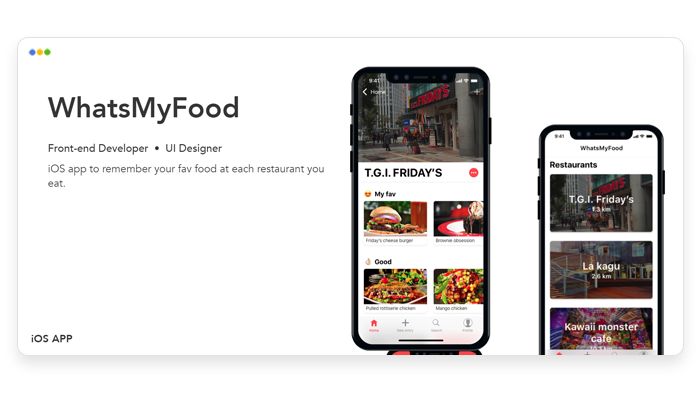
- When possible, link to both the live demo and the source code — snapshots aren’t enough. For abetter visibility, indicate the project’s mobile version via placing a phone icon.
- Production-level applications will be the highlight of your portfolio — these are the best testament to your skills. Of course, it’s not always possible to show these offs (e.g. because the code source is closed or you don’t have any projects of such scale), so feel free to list some personal projects.
- On the topic of personal projects: quality over quantity! There’s no point listing a dozen of to-do apps, weather apps, and calculators — their scope doesn’t really prove your extensive experience, so opt for 1-2 large projects instead.
Ensuring easy access to information

Text is arguably the most important content of your portfolio website, so it’s crucial to structure it properly. A good example is locating the resume: your portfolio website should include an easily accessible link to a PDF version of your resume. As another example, let’s say we have a part of the “About” section that we want to organize; its raw version would look like this:
Education and Contributions: Graduated from the Georgia Institute of Technology in 2015. Co-authored the Getting started with Redux course with Dan Abramov (available under the MIT license). With proficiency in JavaScript and React, I’m looking forward to continuing to contribute to the community.
Although it does provide the necessary information, the styling actually prevents from digesting it. Let’s add some simple features like text formatting and SEO-specific ones like cite:
Education and Contributions: Graduated from the Georgia Institute of Technology in 2015. Co-authored the Getting started with Redux course with Dan Abramov (available under the MIT license). With proficiency in JavaScript and React, I’m looking forward to continuing to contribute to the community.
You can scale this principle across your entire website so that the most important information is easy to find — recruiters will thank you! This is really similar to color-coding and indenting code to make it more readable: the well-structured text gets its point across fast and efficiently.
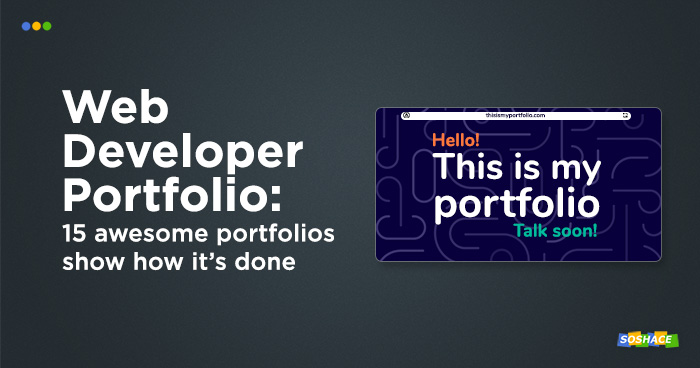
15 examples of awesome web developer portfolios
Disclaimer disguised as a fun fact: some of these portfolios don’t follow every guideline we’ve outlined. Every developer defines their website’s purpose independently, so portfolio websites are sometimes not quite lightweight or easy to use. Another fun fact: some developers don’t provide their surnames in the portfolio, so we had to check their social media/GitHub accounts — was it a clever marketing strategy all along? Yet another fun fact: portfolio websites are really easy to host on GitHub pages (and we have a GitHub Pages guide, wink-wink)
Stephen Kistner and Suresh Murali: clean and inspired by a small Cupertino company
Portfolios by Stephen and Suresh highlight an important point: portfolio’s overall aesthetic can be adopted from a company whose products you love. In these projects, the influence of Apple’s clean visual design is ever so present: rounded corners, floating devices, soft shadows — it’s a global web development trend at this point.
What this portfolio can teach us: Even though “adopting” sounds easy, you still have to make efforts to fine-tune the style of other people/companies to reflect your own style — otherwise, you’re running the risk of being forgettable.
Scott Riley: reads like a real magazine

In his project, Scott utilizes visual tools to make his portfolio website stand out: a vivid color scheme manages contrast, while bold typography does all-those-great-things-that-we-discussed-in-the-“Typography”-section. As Scott focuses on design, his “My work” section conveys this pretty well, preferring visual examples over textual ones.
What this portfolio can teach us: Contrasting color scheme and typography may seem like minor parts, but they can make or break the website.
Dennis Cortés: cards!
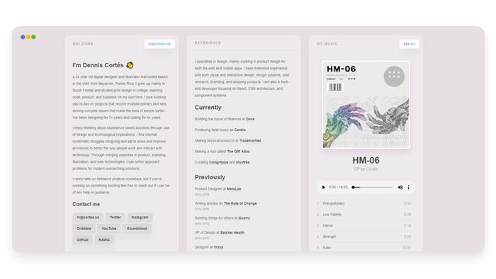
Dennis takes another UI trend, cards, adds a background hue that changes in real-time, and shows how to use it meaningfully. In his case, cards organize and structure his content, serving both as eye candy and as an actually useful tool at the same time. On platforms like Dribbble, projects with cards do look stunningly beautiful but fail the usability test. Thankfully, Dennis has avoided this pitfall
What this portfolio can teach us: Structure your content with both semantic HTML and distinct visual elements.
Edwin De Jongh: awesome design and functionality!
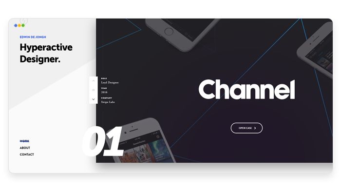
Speaking of Dribbble projects: Edwin’s portfolio may very well amass many positive reactions on this platform, but web developers would probably conclude that it’s too “designy” and sacrifices usability. Edwin, however, has managed to balance design with functionality by adding navigational elements.
What this portfolio can teach us: Don’t be afraid to make the portfolio as cutting-edge as possible: nowadays, everybody knows how to use navigational elements, so you can fit them in your design nicely.
Daniel Sternlicht: interactivity done right
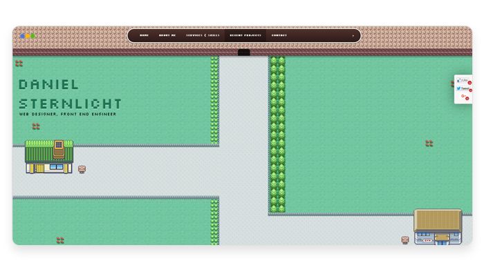
Creating a portfolio website in the form of an interactive game might seem like a really bad idea: should the site user spend an hour killing monsters just to look at the developer’s resume? It’s not the case in Daniel’s project, though; he’s created a little top-down game where you can walk around a city area and enter various buildings — these are, in fact, site sections like “Projects”, “Skills”, “About”, and so on. This would be nightmarish user experience, but Daniel also included point-and-click navigation which allows this “game” to be browsed like any regular website.
What this portfolio can teach us: interactive elements can help your portfolio make it into the “15 Awesome Portfolios” list, but they shouldn’t obstruct usability.
Riccardo Zanutta: case studies done right
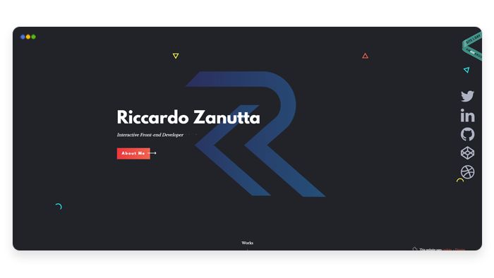
Riccardo, being a front-end web developer, showcases his proficiency with this beautifully designed portfolio. The highlight of this project, however, is the way he presents his case studies — with plenty of visual elements and references, although without delving into too much detail.
What this portfolio can teach us: You present case studies — and case studies represent you.
Kristijan Ristovski and Iheanyi Ekechukwu: text done right
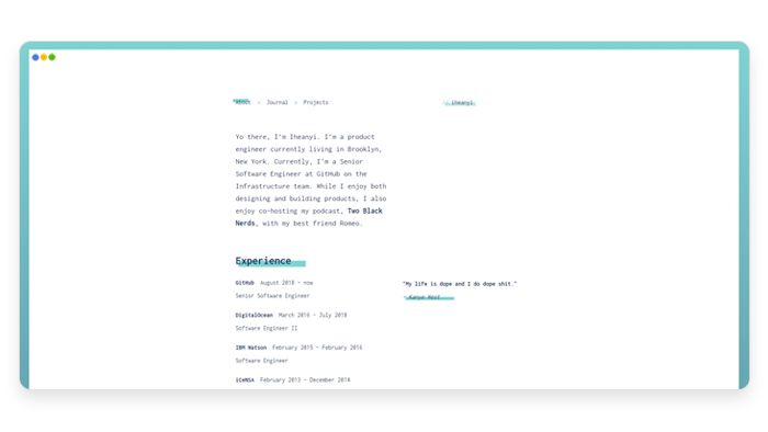
Kristijan and Iheanyi prefer another approach: the simplistic design of their portfolios is almost unnoticeable — and this means that their design works well. Focusing on textual content and presentation, they understand the importance of navigation — distinct sections and links help the user access the content with ease.
What this portfolio can teach us: For text-based content, you can avoid worrying about visuals too much and focus on clear navigation instead.
Sara Vieira and Mikhail Korolev: ls; pwd; whoami
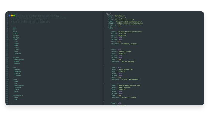
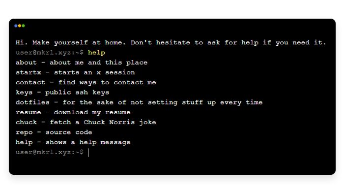
Terminal is a loyal ally of every web developer, so it’s always fun browsing a portfolio as if it’s a command-line utility. Thanks to outputting the resume in JSON, gathering the information about the developer is seamless. Presenting visual content might be tricky, of course — maybe they’d do it via ASCII art?
What this portfolio can teach us: Designing interactive terminal experience is fun, but do remember that most people prefer GUI — when possible, provide your users with a friendlier UX alternative.
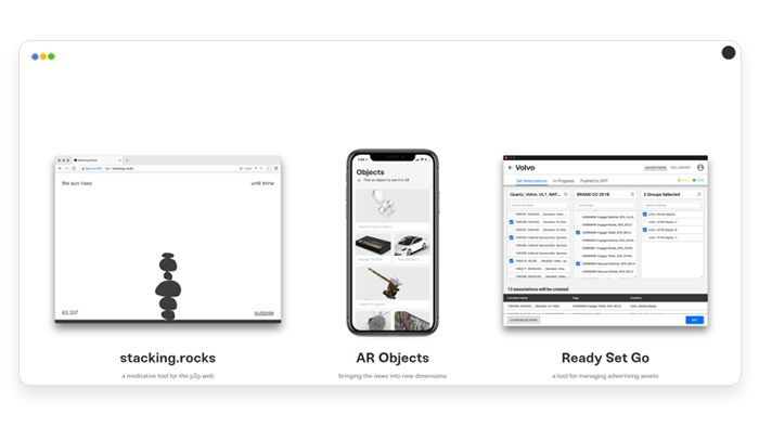
Luke Beard, Martin Laxenaire, Steven Mengin, and Robert Fikes: simply beautiful
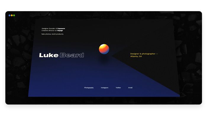
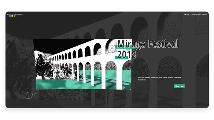
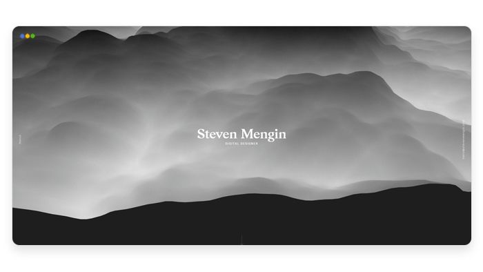
These are probably not the fastest websites on the internet, but sometimes, awesome visuals are all you need.
Conclusion
Your portfolio is important — but you also shouldn’t disregard other aspects. For many employers, merely writing good code doesn’t ensure that the candidate will be the right fit for the company. Having perfected your web developer portfolio, you should focus on other areas, including:
- Preparing for technical interviews.
- Socializing and attending conferences.
- Improving your online presence.
- Understanding the importance of soft skills: (in-team communication, customer interaction, and so on)
As always, our blog will accompany you on this journey. Good luck! 🙂